
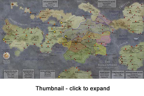
A long time ago, I made a map of the rationalist community.
This is in the same geographic-map-of-something-non-geographic tradition as the Greater Ribbonfarm Cultural Region or xkcd’s map of the Internet. There’s even some sort of therapy program that seems to involve making a map like this of your life, though I don’t know how seriously they take it.
There’s no good name for this art and it’s really hard to Google. If you try “map of abstract concept” you just get a bunch of concept maps. It seems the old name, from back when this was a popular Renaissance amusement, is “sentimental cartography”, since it was usually applied to sentiments like love or sorrow. This isn’t great – the Internet’s not a sentiment – but it’s what we’ve got and I’ll do what I can to try to make it catch on.
Here are some of the best (ie, only) works of modern sentimental cartography I’ve been able to find. Sorry if this ends up a little clickbaity, but I’m annoyed that these haven’t been gathered together in one place before. I am very limited by some of them being offline and copyrighted, so some of these will be teasers rather than the full map. Others will be thumbnails that you can click through to get to the full map or an approximation.
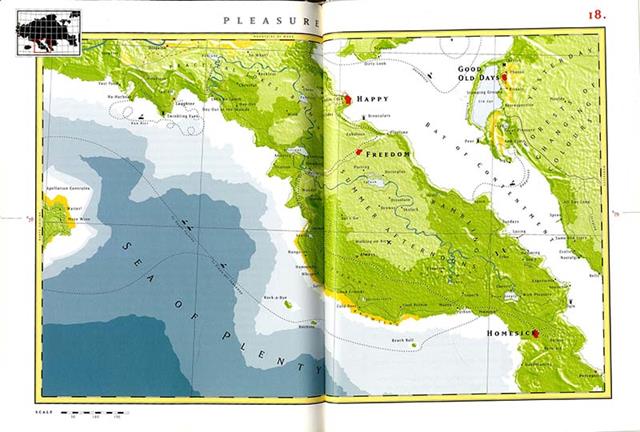
The best modern sentimental cartography I can find comes from illustrator James Turner, who made the Map of Humanity.
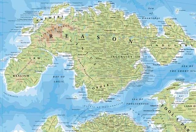
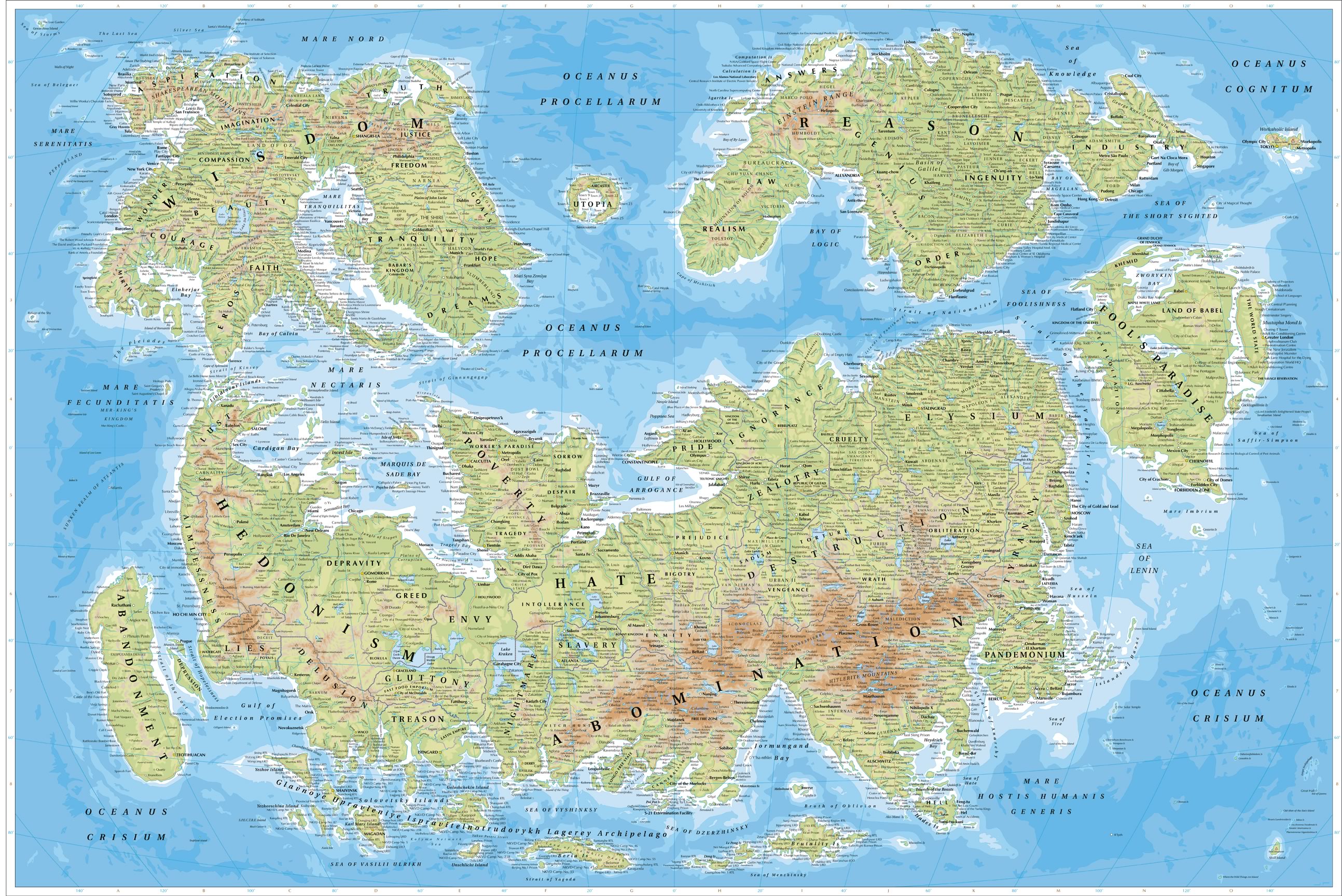
You can find more samples at this site. Turner also has a map of love and relationships, but it’s even harder to find any good images of.
This is all I’ve got
You can buy poster versions of both maps at the SLG Publishing Store, and you really should. This is one of my favorite things in the whole world, and it’s sold a grand total of seven copies so far (I think I might be two of the seven).
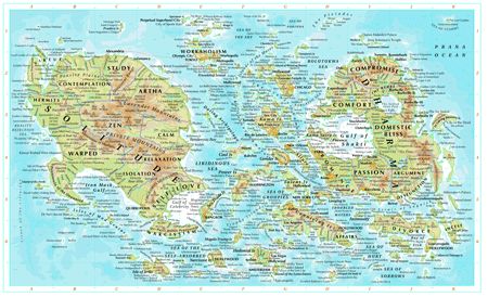
There are some similar works in the Atlas Of Experience, available in part as a website and in full as a book on Amazon. This seems to be their main offering:

And this is a magnification of one of their peninsulae:
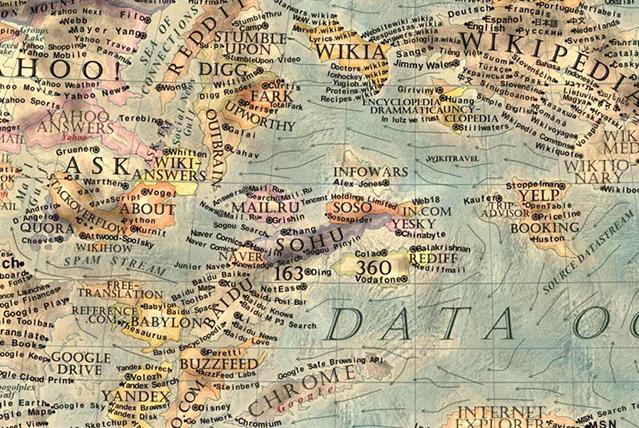
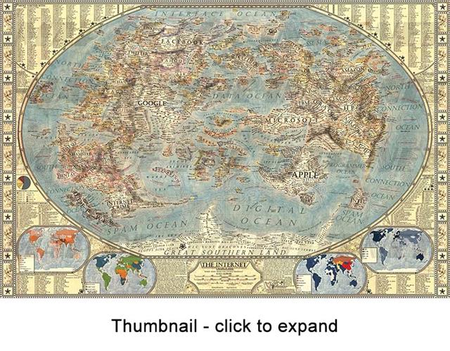
Martin Vargic has a bunch of really good sentimental cartography. The most easily accessible is his Map Of The Internet.
He also has a Map of Literature, not particularly accessible except for teasers:
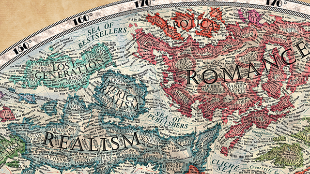
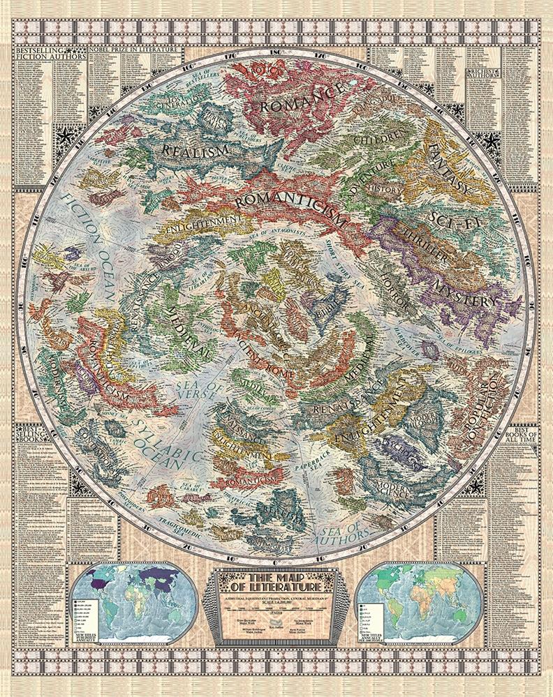
Not a thumbnail, sorry – this is the biggest I have
The full version of this map and several others with no online presence are available in Vargic’s book Miscellany Of Curious Maps.
This is road map of songs whose names sound like things that should be on a road map:
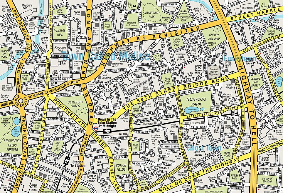
The poster version is available for purchase here, as are a similar TV map, book map, game map, and film map.
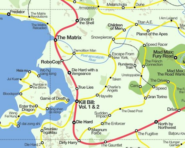
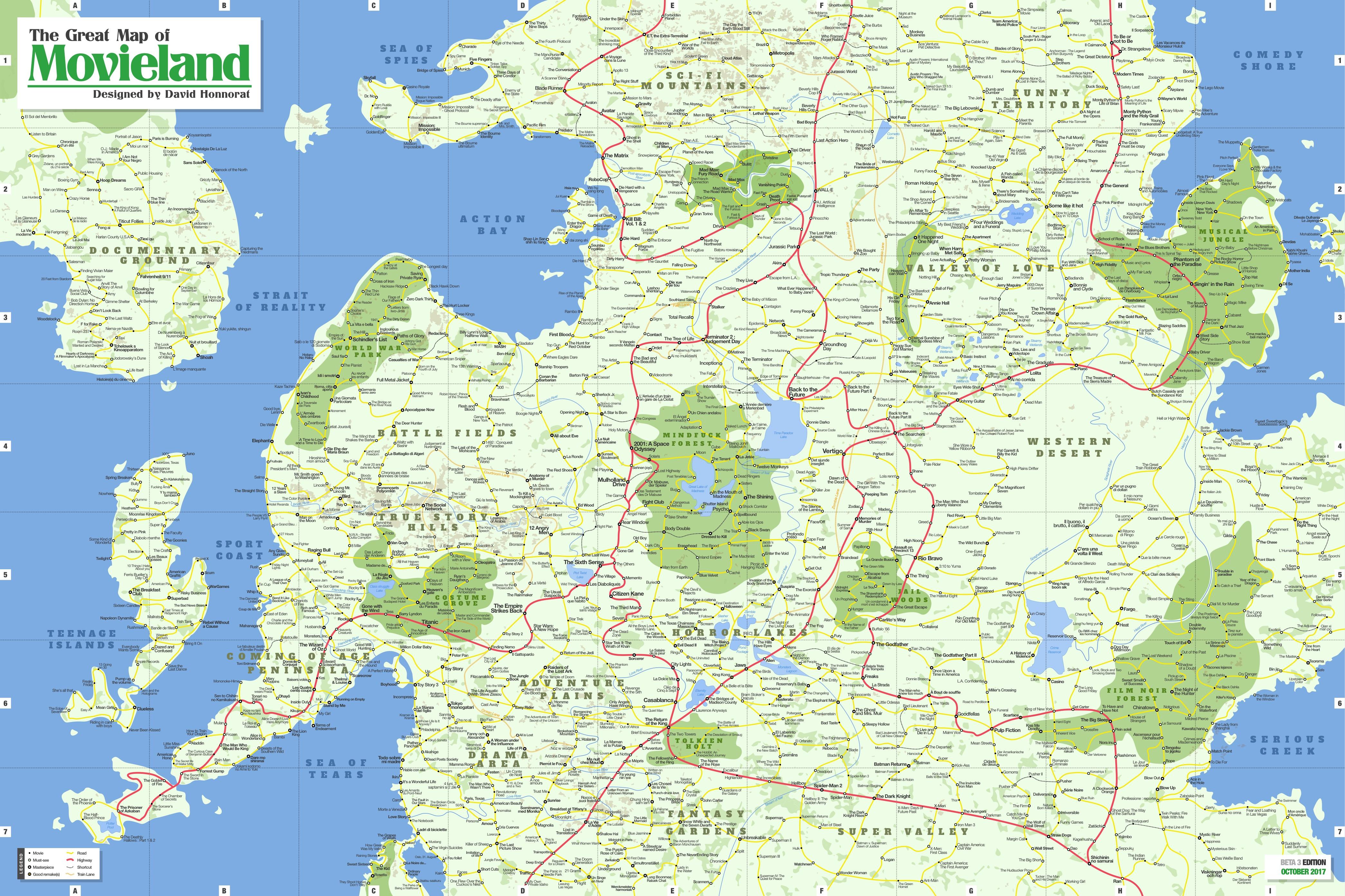
And speaking of film maps, a random Reddit commenter made one:
That’s it. These are literally all the good modern sentimental cartography maps I know. This is a good art, it shouldn’t have died with the Renaissance, and people should do more work to resurrect it.


The “secret treehouse” image is from Warlords II!
I don’t know if this counts, but Simon Patterson’s The Great Bear uses the London Tube map to connect all sorts of named people. https://www.tate.org.uk/art/artworks/patterson-the-great-bear-p77880
I came here to mention the Great Bear 🙂 Also this London Underground style map of different styles of popular music
http://image.guardian.co.uk/sys-files/Guardian/documents/2006/02/02/underground5.pdf
Only just noticed an error in the map of rationality. Pretty sure that river should be flowing from Meaningness to me. 🙂 Given how much inspiration I’ve taken from David Chapman, at least.
Lewis made such a map for The Pilgrim’s Regress. I can’t find the edited and better-quality version of it online, but here’s one: http://2.bp.blogspot.com/-soqxgYSca6Q/UAUtfQ1Rq3I/AAAAAAAAHi4/kU-mGYCNUaM/s1600/pilgrim%2527s%2Bregress%2Bmap.jpg
I took a picture of the third edition map, which removed the railways and the shires.
ETA: From Lewis’ notes on the map:
That’s a hard one to find online.
Another example – really impressive in person – is Qiu Zhijie’s Map of the Theater of the World. Wall view and information can be seen here, and more detailed images can be found on Google Images (one example here).
Registered to point to this exact artist, funny we have the same initials. Qiu has many other works, from the “World Garden”, which he created as the debut installation for the Berkeley Art Museum giant wall just inside the entrance, to… a bunch that I found on Google after I saw that one.
The $20 gift shop print that I bought of the World Garden remains one of my best purchases of all time.
Here is one good one.
Here is another.
Further examples can be found via the typical means.
David
There is this one of poetry : http://www.brechtevens.com/limited
(Mappemonde de la poésie lyrique, 2016)
Maybe a bit more abstract than these other ones, but really cool. Unfortunely there don’t seem to be any good images online, and it is a limited edition…
Here’s a pretty similar idea—Floor Plan of the Mind from subnormality.
I really like that one.
Wow. That’s awesome!
Last year, I made a map of the AI Safety Community. I plan to update it on a yearly basis.
It’s not particularly sentimental, but in terms of sheer rigor we should really mention the Borges / Wright collaboration.
What about ‘The Great Bear’, based on the map of the London Underground?
This is more of a generic map combining all the generic tropes, but I think it sort of fits: the only Sci-Fi star chart you’ll ever need
https://i0.wp.com/media.boingboing.net/wp-content/uploads/2017/04/C9degzhXYAEgmJb.jpg?w=736
A Map of Procrastination… SSC doesn’t seem to be on there, though…
It is not one hundredth as beautiful as your examples, but I’ve seen the Map of Human Sexuality floating around for a number of years.
A few years ago I made a sentimental map of the consciousness research community – https://imgur.com/a/b1R6V12
I’d flesh it out a bit more now (adding in Russellian Monism and panpsychism for example) and do it in Photoshop rather than Paint, but I’m still kind of proud of it!
To be honest, I don’t “get” this at all.
It’s probably like masturbation – more fun for the creator than the viewer. What’s the point? I can’t learn anything from these maps. They’re not aesthetically attractive (in my view). Can someone explain the fun part of generating random noise with Photoshop’s “render clouds” filter, changing the color thresholds until it looks like land and sea, and throwing arbitrary names on arbitrary regions? What meaning do people derive from this?
Maybe it’s gratifying on a fantasy level – you and your friends on tumblr get to pretend you’re all owners of a little island somewhere, or something. For everyone else it’s an incomplete and hard-to-read web directory with no hyperlinks.
I realise this makes me sound like a villain in a Saturday morning cartoon who hates fun.
They can be boring, but embedding things on a plane is a good way to illustrate similarities and differences, like using PCA for data exploration.
Stretching the metaphor with walls, borders, mountains and rivers adds to the dubious enjoyment similar to that produced by puns.
The maps make the distances between concepts more intuitive. Computing these distances (e.g. representing similarity) is already done in a few fields; someone mentioned word2vec, there are also people doing this with movies, music, or political leaning. The usual way of mapping these things from a high-dimensional space to 2D is “multidimensional scaling“; I assume by adding a landscape with natural connections or barriers like rivers, mountain ranges or oceans it is possible to make the reproduction of pairwise distances between concepts more accurate. Doing this programmatically when given the distances as inputs is probably not even “that hard”, I bet Scott knows quite a few people personally who could do that in a weekend or two.
If that’s what it’s trying to do, then the maps of the internet pictured seem contrary to the goal. There are technically a million billion sites but the “real” map of understanding the conceptual distances would be like, 6 or 8 huge overwhelming kingdoms, their slave baronies around the periphery, and an endless sea of sites like SSC that are just one-rock islands in the ocean most people think of as “here be dragons”
The lack of consistency in what greater territory means, what ocean means, what mountains mean, etc. between them says to me the structure wasn’t actually well thought out beyond “I’m making a fantasy map and want it to be interesting like the real world with archipelagos and oooh a lagoon here and…” even though properly pedagogical concept maps of many “conceptual” things might be more like, an endless expanse of landlocked Saharan sand with 3 cities around some oases. These things feel like they were drawn first (maybe outlined and drawn) and then later filled in/labelled with the actual detail
The good ones do actually give me pleasure as a viewer, mostly because they are amusing. Why they are is extremely difficult to articulate, but it must have something to do with the way that the groupings and connections they suggest can be insightful and surprising, and the mappings to geographical features often original and funny (and, indeed, punny, for example, “Amazon’s Secret Cloud Empire” and the various gates, starting with “Gamer Gate”, on the Ribbonfarm map).
Personally I feel like this artform is a case of “seen one, seen them all”. So I’m not so enthused about the call for more.
Should be yudkowsky.net rather than.com
The Turner map has two copies of Mexico City (in Poverty and in Fool’s Paradise).
I haven’t made a map quite like this, but I can tell you how to lay it out automatically. (Making it look like a real map is up to you.)
Here is a map I made of the most common words in English. It is a 300-dimensional map that has been mashed down to five dimensions: two spatial dimensions, radius, and one color dimension. On my system it actually has a third spatial dimension, so I can rotate it around.
I used t-SNE in Matlab for the dimensionality reduction, and word2vec for the original 300-dimensional vectors. If you used just two dimensions, and included just the words in a particular part of this space, you could make a map of whatever you like. word2vec doesn’t always get things right, but I think that for this purpose you would find it as satisfying as looking at someone else’s mental map for almost any subject. Here are the key lines from the program (it has been edited since I output this, so the color and radius might not have quite the same transformations applied):
[mappedX, mapping] = compute_mapping(near_vectors', 'tSNE', 5);scatter3(mappedX(:,1),mappedX(:,2),mappedX(:,3),((mappedX(:,4)-min(mappedX(:,4)))+.1),mappedX(:,5)+1,'filled');
%scatter(mappedX(:,1),mappedX(:,2));
This is very helpful, thank you. I figure it is only a matter of time before there is a good machine learning pipeline for sentimental cartography.
Do you have sense of what values of the t-SNE parameters are likely to give “map-like” arrangements of data (in terms of how the clustering looks)? Or will that be very data-dependent?
To turn this into something that looks like map, with land and water and such, you could probably just set a blue background and then apply a smoothing kernel with a random shape to each point and color it light brown. Then add a function to draw random rivers and mountains on the land.
I used the default parameters in the dimensionality reduction toolbox command compute_mapping for t-SNE: perplexity = 30 is the only one I see that you can change there.
I was imagining the words as cities on the map, and that you would draw coasts where there were large gaps, and rivers where there seemed to be chains of connected words. I didn’t think about landforms.
This: http://lophi.ramdam.space/images/philo4layers.jpg
Is a pretty cool map of philosophical positions. Not Renaissance in style, but still clever.
Okay, I think you might need to be a registered member to view attachments, I don’t know if any of the relevant images are hosted externally, and between it being a long thread, being blind, and the forum in question not having features my screen reader’s navigation hotkeys can work with, but would the Map of the Helicopter Cube’s Shape Space posted at http://www.twistypuzzles.com/~sandy/forum/viewtopic.php?f=1&t=28265
qualify?
Also, are any of these available as physical tactile maps?
One would be remiss not to mention the Map of Metal (warning: autoplays music)
People who are interested in this kind of thing should definitely check out the Texas A&M University map collections. One of the research librarians, Sierra Laddusaw, recently organized an exhibit on science fiction and fantasy maps, and she’s been getting the library to acquire some of these “idea maps” as well as she’s been calling them. If you want to see the exhibit they had been putting on (which I think is just a fraction of the collection), it appears to be here (I think the “View/Open” pdf link halfway down the page works for everyone – I don’t think my computer is logged on to the campus network right now).
People here may also be interested in knowing about the general science fiction and fantasy research collection here. It’s got the personal archives of many well-known science fiction and fantasy authors (the two I’ve been most interested in are George R.R. Martin and Ada Palmer – and before you ask, the drafts for Winds of Winter are in secure storage so you can’t check them out, but you *can* look at the manuscripts for all the earlier books in the series, and see some of the things that were changed).
One that’s useful for C++ programmers is the map of STL algorithms: https://www.fluentcpp.com/getthemap/
There’s also a big map of whole C++. (Looks like the old source is dead, but this one works for me. And here is the most modern version.)
Map of Human Sexuality. NSFW, obviously, and take care in googling any words you don’t recognize. Has a feature that lets you put pins in places you’ve been or want to go.
I best like that one where Dharma is an angry lobster chasing the frightened crab Solitude.
The maps themselves look cool and are clever ideas, but even setting aside the style of cartography, I’m intrigued by how people cluster ideas and determine where to rank them for this sort of project. Someone above mentioned multidimensional scaling and Word2vec, both of which I’m unfamiliar with but which look compelling in terms of ability to meaningfully cluster similar ideas.
My question is: where else has this sort of clustering been applied? In particular, is anyone aware of an attempt to sort a website like reddit in this way–visualizing, for example, which subreddits have high overlap of content and posters? Or a space like WordPress–show which blogs have what degree of overlap. I’ve been keeping an eye out for projects like that, but I haven’t seen them to the extend I’d expect.
Taken to another level, I could imagine something like this being a useful sorting system for a content aggregator: form “natural” clusters of similar content, then sort comments using some combination of user feedback and these tools (so that, for example, if one group agreed with viewpoint A in the comments, and disagreed with viewpoint B, and another agreed with viewpoint B and disagreed with viewpoint A, the comments would split into visibly separate clusters).
It would be similarly informative to try to map an ideology out like this–visualize which ideas are central to the ideology and come up constantly, which ones are peripheral, and so forth. Or to map one’s own thoughts–mark what you think about regularly, how it connects with other ideas you have, and create a visualization of your headspace. It could even be used to compare ideologies at a glance, showing where their ideas agree most, disagree most, and where one covers topics not mentioned at all by another.
Also: if someone wanted to gain the technical skill to work effectively with the tools mentioned above, what would be the most direct route to take towards that? Statistics, programming, something else? I’d like to play around with these tools and these ideas, but I’m a novice in this domain.
These conversions of discrete things (e.g. words) to vectors using Machine Learning are called embeddings.
They’re important when dealing with a big, sparse (i.e. most values are 0) grid of booleans.
Recommendation systems (likeYoutube’s ‘Reccommended for you’) tend to rely on them.
Subreddits have probably been mapped in this way and put on r/dataisbeautiful. If not, I’ve been meaning to learn ML lately, and will take a shot of making embedding subreddits in a vector space.
Google Tensorflow has some documentation on them. It might be worth going through their ML crash course, since it covers that kind of thing.
https://www.tensorflow.org/guide/embedding
There are a many maps like this of scientific fields (perhaps especially physics and math, or maybe those are just the ones I’ve looked for)
e.g.
1939: http://www.eoht.info/page/Map+of+Physics
recent, less geographic: http://scientifist.com/map-physics-different-fields-connected/ http://scientifist.com/map-of-mathematics/
recent, more geographic: https://plus.google.com/101584889282878921052/posts/AcUBb8Y9uBj
Also, (generally networks rather than geographic) maps of science as a whole e.g. http://scimaps.org/atlas_of_science_images_pt1.html http://journals.plos.org/plosone/article?id=10.1371/journal.pone.0039464 https://academia.stackexchange.com/questions/3490/is-there-a-network-map-of-subjects-and-how-they-connect-with-each-other
I’m impressed with how well the maps of science agree on a circular structure, math-phys-chem-geo-bio-med-neuro-psych-soc-econ-compsci-math.
Oh neat, perfect timing from Futility Closet: https://www.futilitycloset.com/2018/07/22/the-map-of-discernment/
And see also a bunch of traditional sentimental cartography in the archives:
https://www.futilitycloset.com/2012/05/31/love-maps/
https://www.futilitycloset.com/2016/07/31/love-maps-2/
https://www.futilitycloset.com/2017/03/06/good-luck/
https://www.futilitycloset.com/2017/09/26/the-attack-of-love/
https://www.futilitycloset.com/2017/10/03/field-reports/
What is “Alicornfic”? I thought I knew all the rationalist community fanfiction, but I’ve never heard of that. A quick Google search gets no relevant hits.
(Took me a while to get how you got that name from this page, then I saw it’s in the rationalist community map.)
It refers to fiction by Hannah “Alicorn” Blume. This page gives examples.
The science cartoonist redpenblackpen made a Map of Manuscript Earth, including a new larger version:
New version
Original version
It’s a map of the process of writing a scientific paper.
If video games are your thing…
A few things came to mind more from the art world:
Qiu Zhijie in particular is a prolific contemporary Chinese artist with a number of pieces based on fictional maps. The Guggenheim Museum commissioned an enormous piece for its “Art and China after 1989: Theater of the World” exhibit covering the historical, cultural, and political events that have impacted Chinese contemporary art. It has a “Canyon of Globalization” (with a slope for the Thucydides Trap), a mountain range of “Peak China Dream”, and a region for “China-Taiwan Relations”, along with many references to the Chinese contemporary art scene (798 District, political pop). He has a number of other maps pieces as well.
https://www.guggenheim.org/artwork/36123
Another artist that comes to mind is Saul Steinberg, who was a long-time illustrator for the New York Times. The most famous is his “View of the World from 9th Ave” which has it’s own wikipedia page. But he’s done a large number of them, include “Flight Map” which hilariously includes drink, coffee, hypochondria, daze along with layover stops.
http://saulsteinbergfoundation.org/essay/view-of-the-world-from-9th-avenue/
If you’re into Jordan Peterson, someone has made his Maps of Meaning into a map with a guided tour.
Check this out!
http://mapofmetal.com/
Ooh there are beautiful examples by Grayson Perry, a well-known British artist, which use traditional etching techniques. They’re a little off-piste in that they cover even more abstract concepts than you’ve mentioned, but they’re worth a look just for the exceptional craftsmanship.
There are three that map his own psychology, Map of Days, Map of Nowhere, and Map of an Englishman. His Island of Bad Art is perhaps closer to your examples.